What to Wear for Your Family Photoshoot!
A common question I'm asked by my clients is "What should we wear in our photos?" and I am more than happy to assist you with choosing the perfect outfits for your family! To help you achieve the look you desire for your photos I have put together some tips for choosing your outfits, and some color schemes to coordinate your family's look!
Feel free to ask any questions you may have!
General Clothing Tips
1. COORDINATE COLORS BUT NO MATCHING OUTFITS
You want to avoid everyone having "matching" clothes. Instead, you want to coordinate colors. That means that everyone should not be wearing the same color on top, or everyone wearing plaid- instead find 2-4 colors that go well together and mix and match with everyone wearing something a little different, but coordinated!
2. TRY TO CHOOSE A SEASONAL COLOR COMBINATION
There are basic color combinations that work for each season. I have put several coordinating wardrobe examples further down this page to help inspire you!
3. START WITH A FAVORITE ARTICLE OF CLOTHING
I usually suggest clients first look through their wardrobe and find one article of clothing that is their favorite. This can be a solid color or a pattern. A plaid shirt or a patterned dress is a great place to start because they incorporate at least 2 or 3 colors which can be used to build your outfits around.
4. COORDINATE OUTFITS AROUND YOUR FAVORITE PIECE OF CLOTHING
Now that you’ve chosen your first article of clothing, you can build all of the other outfits around it, using colors that coordinate well together. To do this, take your one piece of clothing and start going through your other clothes that you already own. Chances are, you have some that will coordinate well. I limit patterns to one or two pieces and put everyone else in solids. Layers (jacket, sweater, vest, etc.) and textures (chunky knits, tulle, lace, etc.) are great and add visual appeal.
5. FILL IN THE MISSING PIECES
After you’ve pulled the clothes that you currently have together, start looking at the gaps that need to be filled in. I like to lay all the pieces on my bed and look at everything together. That way, I get a clear idea of what I still need. Remember, we want 2-4 colors. When I figure out what I'm missing, I make a shopping trip to find the rest of the pieces I need.
6. DON'T FORGET THE SHOES
Shoes do matter! You don’t want to show up to your photoshoot looking gorgeous in your clothes but ruin your look with your scuffed up sandals that clearly show their age, and you also probably don’t want to spend a lot of money on shoes if you don't have to! I get it! I have a family of 6 so I know I can’t buy everything new for a photo session. So, again, look through what you have. If shoes need to be cleaned up or scuff marks taken out, do that to bring new life into them and make sure to choose shoes that are right for your outfits.
Check out the examples below to gain ideas and inspiration as you build your color coordinated outfits! Have fun and
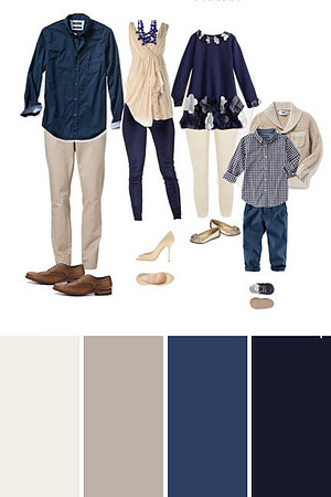
NAVY, CREAM AND TAN
Navy, cream and tan is a classic color scheme for family photos that works well for any season. The navy and cream pair beautifully with the pastel florals and bright greens of spring. They also look perfect among green grass and leaves at a park for summer family pictures. And these ‘neutral tones’ compliment the bright yellows and oranges of fall foliage.

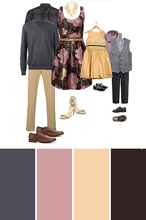
GRAY, PINK AND GOLD
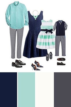
AQUA AND NAVY
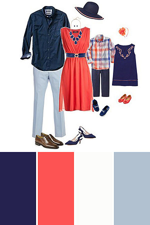
CORAL AND NAVY
You will find most color schemes have one or two bright or vibrant colors paired with one or two ‘neutral’ tones. In this outfit the coral is a bold focal color. Navy, gray and white all act as neutral tones that help balance out the vibrant coral and ground the outfit.
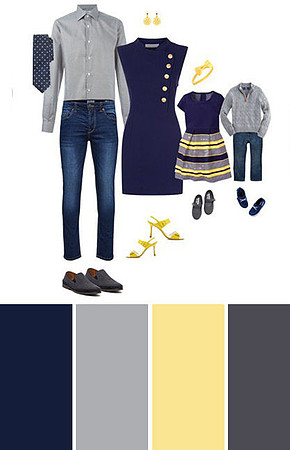
NAVY AND YELLOW
Another example of a color scheme for family pictures that uses a bright color (yellow) in small amounts. And then balances it with neutrals (gray and navy).
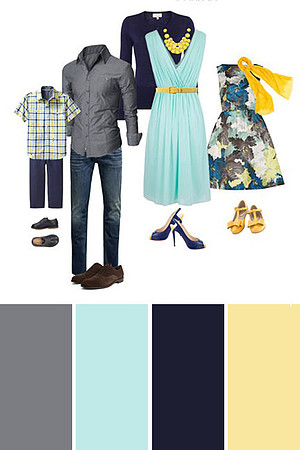
AQUA, GRAY AND YELLOW
Aqua, gray and yellow are a perfect color scheme for spring or summer photos.
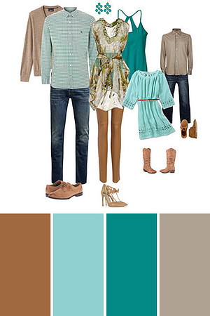
TURQUOISE AND TAN
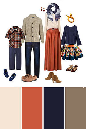
BURNT ORANGE, TAN AND NAVY
This family outfit has the perfect color scheme for golden fall leaves.
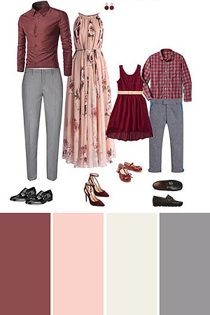
PINK, WINE AND GRAY
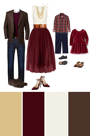
WINE, CREAM AND GOLD
I love this color scheme for holiday family photos. So often we think red and green for Christmas pictures. But using a color scheme of wine, cream and gold still gives a festive feel if you plan to use them for Christmas cards. But it is also classic and traditional enough to hang in your home year round.
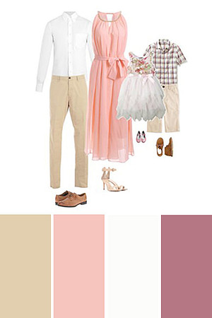
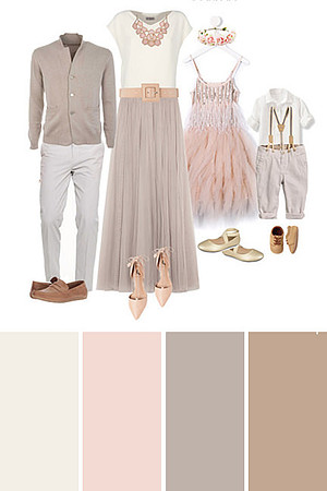
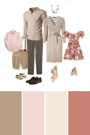
PINK, TAN AND CREAM
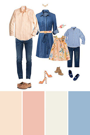
PEACH, BLUE AND DENIM
Peach, blue and denim is a favorite color scheme for spring family pictures. The peach blends perfectly with pastel toned spring flowers while the denim help act as a neutral to keep the outfit from competing with all the amazing colors nature has to offer in the spring.
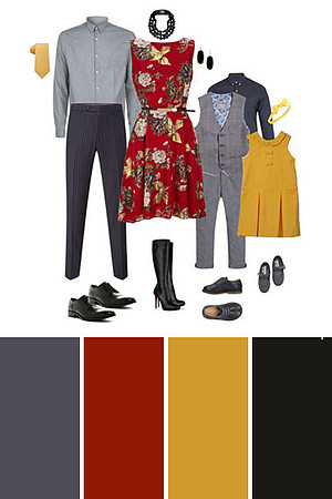
RED, MUSTARD AND GRAY
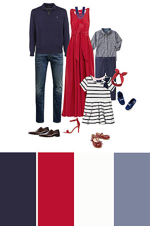
RED, WHITE AND BLUE
This red, white and blue color scheme just feels right for a 4th of July family photos. Red can be a tricky color to use in pictures because it can really demand attention. But, it can also help create a striking family portrait. If you plan to use red as part of your color scheme be sure to consider your session location. The neutral tones of a beach or urban downtown session would be a perfect backdrop for this color scheme. While a grassy park with lots of green, may leave your picture feeling a little more Christmassy than you expected.
GRAY, BLUE AND TAN
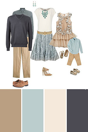
I hope that these ideas have inspired you and not overwhelmed you! Don't forget, start with one outfit that you love- that you feel confident and beautiful in- and build everyone else's outfit around it.
Have fun with the process! I can't wait to see what you choose!
Kari
